

Embedded Analytics in SaaS: A 2026 Guide to Building Dashboards Your Users Will Actually Use
August 21, 2026
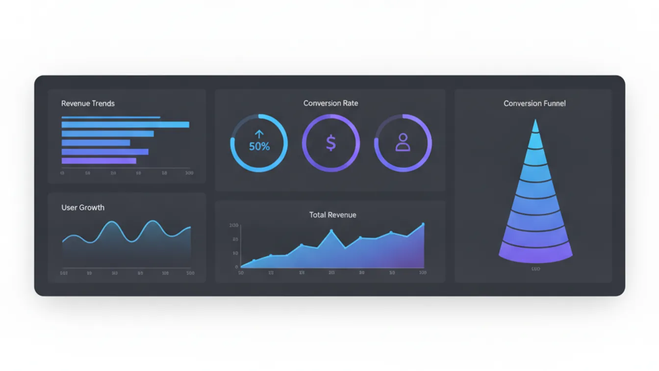
Analytics is one of those features that makes it onto every SaaS product roadmap and then quietly underperforms for years. The dashboard gets built, the charts render, and users open it once — then go back to exporting CSVs and building their own spreadsheets. If that sounds familiar, the problem is rarely the data. It is almost always the decisions made before the first chart was drawn: what to measure, how to surface it, and how deeply the feature is woven into the product’s core workflows.
This guide covers what it actually takes to build embedded analytics that users return to daily — the architecture choices, the UX principles, the charting decisions that separate useful from impressive, and the honest build-vs-buy calculation that most teams get wrong.
Why Most SaaS Dashboards Get Ignored
Before fixing analytics, it helps to understand why generic dashboards fail. The most common patterns are:
- Metric overload. A grid of 30 KPI tiles feels thorough at launch and overwhelming forever after. When everything is surfaced, nothing is actionable.
- No connection to decisions. Users are happy to look at data when it tells them what to do next. If the chart just confirms what they already know, they stop looking.
- Lag. A dashboard that’s 24 hours behind creates a mental gap between the user’s current work and what they’re seeing. Even a few hours of staleness erodes trust.
- Export as the escape hatch. If the most common action on your analytics screen is “Export to CSV,” the feature hasn’t replaced the workflow — it has just added a step before the real work begins.
The goal of embedded analytics is not to give users data. It is to give them insight they can act on without leaving your product.
Getting the Data Architecture Right First
Before you write a line of frontend code, the data layer determines what is possible. Two models dominate:
Event-driven pipelines
Every meaningful action in the product fires an event — a user completes an onboarding step, a transaction is processed, a file is uploaded. Those events are streamed to a warehouse or OLAP database where they can be queried efficiently at scale. This is the right model for behavioral analytics (“how are users moving through the funnel?”) and for features that need near-real-time freshness.
Snapshot-based aggregates
At scheduled intervals, the application database is summarized into pre-aggregated tables — daily active users, weekly revenue by segment, inventory turnover by SKU. This is simpler to build and reason about, performs well for large datasets, and is the right choice when the underlying data changes slowly or when you already have strong ETL infrastructure.
Most mature SaaS products end up using both: events for behavioral and engagement metrics, snapshots for business metrics. The key architectural decision is to separate your analytics database from your application database early. Queries over millions of rows can hammer a Postgres instance that was sized for transactional loads, and the performance problems tend to surface at the worst possible time.
What Users Actually Want From a Dashboard
Run usability sessions on your analytics feature — even just five unmoderated recordings — and you will see the same patterns emerge:
Users want answers, not charts. The most-clicked element in most SaaS dashboards is the table underneath the chart. The chart is a headline; the table is the story. Design for both.
Context collapses value. A number without a comparison is noise. Revenue of $142,000 this month is meaningless until you know it is up 12% from last month and 8% below the same period last year. Every metric should have a default comparison — period-over-period or benchmark against a relevant cohort.
Filters are the primary interaction. Users want to slice by date range, by customer segment, by product line, by geography. Give them fast, persistent filters that stay across sessions and can be saved as named views. The power user who builds a “Q3 APAC Revenue” view will return to it every morning.
Alerts are the multiplier. A dashboard the user has to remember to check has limited value. A threshold alert that tells them when a metric moves outside a normal range makes the same dashboard infinitely more useful — they only need to look when there is something to see.
UX Principles for Embedded Analytics
The best-performing dashboards share a few design principles that are easy to name but often hard to execute inside a product development cycle:
Progressive disclosure
Show the headline first — the three or four numbers that answer the question the user came in with. Let them drill into detail from there. This respects the user who needs a five-second answer and still serves the analyst who wants to build a query. The worst pattern is a dashboard that forces everyone to scroll through 15 sections to find what they need.
Spatial consistency
Once a user has learned where the revenue chart lives, it should always be in the same place. Dashboards that rearrange on load, or that change their layout when data is missing, create uncertainty and reduce trust. Design for empty states explicitly — show a “no data yet” placeholder in the chart’s normal position rather than collapsing the layout.
Speed as a feature
Perceived performance matters as much as actual performance in analytics UIs. Load the layout skeleton first, stream data into charts as it arrives, and cache aggressively on repeat visits. A dashboard that opens in under a second, even if the deeper slices take longer to load, feels fast. One that shows a spinner for three seconds before anything appears does not — even if the underlying query is genuinely fast.
Accessible color and contrast
Analytics relies on color encoding more than most UI surfaces, which makes color accessibility non-negotiable. Use a palette that is legible for deuteranopia (the most common form of color blindness) by default, and never rely on color alone to encode a critical difference — pair it with a label, a pattern, or a shape. The UX/UI design work we do for SaaS clients treats accessibility as a build requirement, not a post-launch audit item.
Charting Choices That Matter
The most common charting mistakes in SaaS products come from choosing the chart that looks most impressive rather than the one that answers the question most clearly.
- Line charts for trends over time. Simple, honest, readable. Use them when the question is “how is this changing?”
- Bar charts for comparisons. When the question is “which segment is largest?” or “how does this month compare to last?”, bars are clearer than lines.
- Tables for exact values. When users need the number itself — not the shape of a trend — a sortable table with conditional formatting beats any chart.
- Scatter plots sparingly. Useful for correlations across two continuous variables. Almost always misused everywhere else.
- Avoid pie and donut charts. Human visual perception is poor at comparing arc lengths and angles. A horizontal bar chart with percentage labels does the same job better.
The chart type is a design decision. Revisit it with real users, because what the product team finds elegant and what an operator using the tool at 8am every morning finds useful are frequently different things.
The Build vs. Buy Calculation
The most expensive mistake in embedded analytics is building from scratch when buying would have shipped the same business value in a fraction of the time. But the second-most expensive mistake is buying a generic BI platform and embedding it in your product, only to find that the white-labeling is shallow, the UX jarring, and the pricing unsustainable as your user base grows.
Here is a framework for making the decision honestly:
Buy (third-party embedded analytics platform) when:
- Analytics is not a core differentiator in your product — it is table-stakes functionality users expect but will not pay a premium for.
- Your team has limited data engineering depth and needs to move fast.
- The platform’s out-of-the-box chart types and data connectors cover your use cases.
Build custom when:
- Analytics is central to your product’s value proposition — users pay specifically for the insights you surface.
- You need deep integration with your product’s data model, permissions system, and UI design language.
- You are building in a regulated industry (healthcare, finance, logistics) where data residency and audit trail requirements need to be custom-designed.
For most SaaS products we work with, the right answer is a hybrid: buy a charting library for the rendering layer (Recharts, Apache ECharts, or Vega-Lite are all solid), build the query layer and data model yourself, and design the UX from scratch rather than inheriting a generic BI skin. This gives you control over the experience without rebuilding primitive charting logic from zero.
The Rollout That Actually Gets Adoption
Shipping the dashboard is not the end of the work. The feature needs to be introduced in context, not as a menu item that users discover accidentally.
Embed analytics in the workflows users already have. If your product has a “project completed” view, that is the right place to surface the associated productivity metrics — not in a separate “Analytics” tab. Contextual placement multiplies usage because it does not require a behavior change; the user is already in the right frame of mind.
Set up an onboarding prompt the first time a user sees a new dashboard — one sentence that explains what the view is tracking and what they should do if a number looks off. Users who understand why a chart exists are far more likely to act on it.
Finally, treat analytics like the rest of your product: instrument it. Track which charts are expanded, which filters are applied most, and which dashboards are never opened. The usage data from your analytics feature is the product feedback for improving it.
Shipping Analytics That Earns Its Place
Embedded analytics done well becomes one of the stickiest features in a SaaS product — the thing users check every morning, the feature they mention in renewal conversations, and the capability that separates your product from lighter-weight competitors. Done poorly, it is a maintenance burden that users work around.
The difference lies in the decisions made before the first sprint: a data architecture that can handle the query load, a UX built around decisions rather than displays, and charting choices that prioritize clarity over impressiveness.
If your team is planning an analytics feature for a new product or refactoring one that has not found its audience, we can help you make those foundational decisions the right way — and ship something users actually return to.
Start a project with Nevrio to build embedded analytics that becomes one of your product’s core strengths — or get in touch to talk through your data and dashboard requirements first.
